


- Products
- Catalogs
- News & Trends
- Exhibitions
Decorative paint KITTIWAKEinteriorexteriorfor wall


Add to favorites
Compare this product
Characteristics
- Function
- decorative
- Location
- exterior, interior
- Application
- for wall, for door
- Support
- for wood
- Component
- water-based
- Color
- blue
- Options
- low-VOC
Description
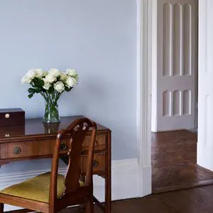
A clean, cool blue
This clean cool blue is inspired by the wings of seabirds when seen in bright sunlight. Sitting between Parma Gray and Lulworth Blue, Kittiwake has a touch more black pigment creating a warmer, more relaxed feel. This shade is perfect for living spaces, staying truly blue in all lights. It also complements stainless steel especially well, so is ideal for contemporary kitchens. A sophisticated blue, it looks fantastic with Wine Dark and Borrowed Light.
Recommended Primer & Undercoat: White and Light Tones
Complementary white: Strong White
Key features
The finest ingredients
We’re dedicated to perfecting the art of paint. At our home in Dorset, we combine the finest ingredients, 75 years of experience and technical precision to help you create beautiful spaces that stay beautiful. Even in our colour rich paints, less than 8% of the tin is the colour. The other 92% is what creates the quality, depth and extraordinary response to light that transforms your home.
Paint is like coffee. The colour is the froth on the top, but it’s the quality of the rest of the cup that makes it taste good.
– Richard Ball, Farrow & Ball Co-founder
We use twelve exclusive pigments, all specifically selected for their colour intensity. We take colour seriously, so naturally, we only accept the very best. By using these same pigments to make every colour in our palette, all our shades combine effortlessly, making it easy for you to put together a cohesive colour scheme.
VIDEO
Other Farrow & Ball products
Blue Paint Colours




Related Searches
*Prices are pre-tax. They exclude delivery charges and customs duties and do not include additional charges for installation or activation options. Prices are indicative only and may vary by country, with changes to the cost of raw materials and exchange rates.
About ArchiExpo
ArchiExpo is a marketplace that offers B2B players a complete experience, from product sourcing to purchase. ArchiExpo is an entity of VirtualExpo Group.
Are you a buyer?
Are you a supplier?